CSS - Images
The Web is filled with sites featuring beautiful, rich graphic design that takes advantage of the power of CSS. In this lesson we will discuss some of the many ways that images can be displayed or used as backgrounds in various elements.
Part 1: How to add borders to images (Sorry! Some Review)
Photographic images (and illustrations), which might be used to illustrate an article or be displayed in a photo album, look neat when they’re bordered with a thin line. However, it’s a time-consuming process to open each image in a graphics program in order to add borders, and if you ever need to change a given border’s color or thickness, you’ll be required to go through the same arduous process all over again for each element. 100 pictures in your site and you could have to make 100 changes. Lots of work... what if you make a mistake. Fortunately, CSS makes this chore a whole lot easier.
To get started download the following file so you can follow along:
To get started download the following file so you can follow along:
|
| ||
|
Add the following rule to your style section. It will add a two-pixel black border to our images:
img { border-width: 2px; border-style: solid; border-color: #000000; } The rule could also be written in shortened form: img { border: 2px solid #000; } |
Wow... so much better with a border. With such a simple change things seem more professional in their appearance and stand out more.
|
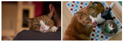
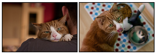
Now this is all well and good, but your layout probably contains other images to which you don’t want to apply a permanent black border or maybe you want to apply a totally different border. For instance, we might want the border only around the image of the cat laying on its paw and not around the cat with the toy in its mouth. Or maybe we want the border around the cat with the toy to be the same size but dotted and a different color.
Not likely that you would want this ugly looking border, but the point is to show that with the use of classes, you can have different styles applied to different images. |
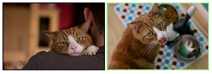
The solution is to create a CSS class for the border and apply it to selected images as required.
First, add the following rule to your style section to create a CSS class: .imgborder { border: 2px dotted #33ff00; } Then inside the tag of the specific image you want to impact, you specify the class you want to apply: <img src="images/widget2.jpg" alt="Widget shows his tongue" class = "imgborder"/> |
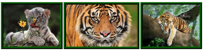
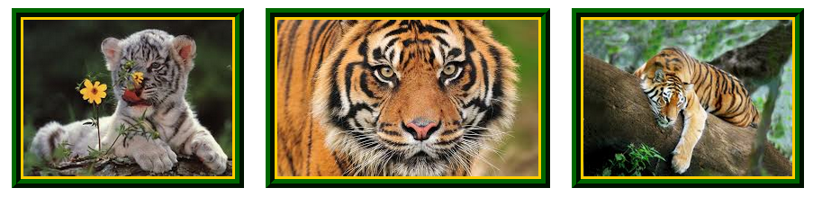
If you’re displaying a selection or group of images—such as a photograph album—on the page, you could set borders on all the images within a particular container, such as an unordered list or div section that has a class applied. To get started, lets look at the row of big cats (yes.. they are tigers)
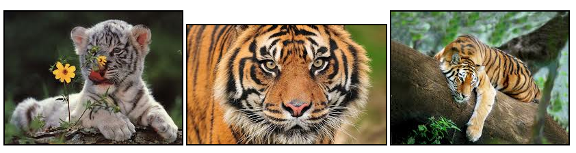
You should notice that they all have the same border that we defined previously. But things really don't look great. For starters, they are all different heights. But yuck... who wants to create a class and then put or apply that class in each of the image tags. Wouldn't be too bad if we only had these three images, but imagine you ha a few hundred thumbnails to style. I can already here you groaning.
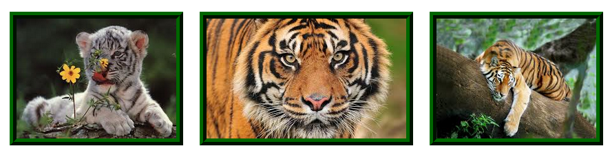
Step 1: Let's create a <div> section around the code where we specify the three images.
<div>
<img src="images/tiger1.jpg" alt="tiger with flower" />
<img src="images/tiger2.jpg" alt="tiger head" />
<img src="images/tiger3.jpg" alt="tiger in tree" />
</div>
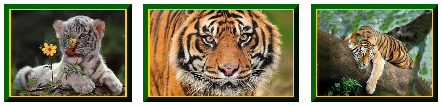
Step 2: In your style section, create a rule that will effect these images.
.album img {
border: 10px ridge #006600;
height: 174px;
}
Step 3: Apply the class within the <div> tag you created. This approach will save you from having to add the class to each individual image within the container.
<div class = "album">
<img src="images/tiger1.jpg" alt="tiger with flower" />
<img src="images/tiger2.jpg" alt="tiger head" />
<img src="images/tiger3.jpg" alt="tiger in tree" />
</div>
Voila: What a difference!
<div>
<img src="images/tiger1.jpg" alt="tiger with flower" />
<img src="images/tiger2.jpg" alt="tiger head" />
<img src="images/tiger3.jpg" alt="tiger in tree" />
</div>
Step 2: In your style section, create a rule that will effect these images.
.album img {
border: 10px ridge #006600;
height: 174px;
}
Step 3: Apply the class within the <div> tag you created. This approach will save you from having to add the class to each individual image within the container.
<div class = "album">
<img src="images/tiger1.jpg" alt="tiger with flower" />
<img src="images/tiger2.jpg" alt="tiger head" />
<img src="images/tiger3.jpg" alt="tiger in tree" />
</div>
Voila: What a difference!
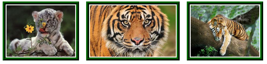
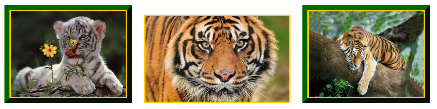
The photos seem a little crowded or crammed together. We can use the margin property to control the spacing that occurs around an element (such as a picture)
.album img {
border: 10px ridge #006600;
height: 174px;
margin: 10px;
}
.album img {
border: 10px ridge #006600;
height: 174px;
margin: 10px;
}
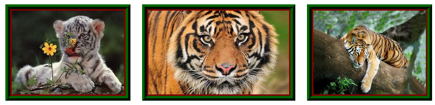
In addition, we can use the padding property to control the spacing that occurs between the actual image and the border we applied to the image.
.album img {
border: 10px ridge #006600;
height: 174px;
margin: 10px;
padding: 3px;
}
.album img {
border: 10px ridge #006600;
height: 174px;
margin: 10px;
padding: 3px;
}
In addition, if we don't like the white inset, we can use the background-color property to the color of the area between the border and the image.
.album img {
border: 10px ridge #006600;
height: 174px;
margin: 10px;
padding: 3px;
background-color: #800000;
}
.album img {
border: 10px ridge #006600;
height: 174px;
margin: 10px;
padding: 3px;
background-color: #800000;
}
You would get an incredibly different effect if you changed the background color you specified:
Or changed the style of border you chose to use: (Remember: there were lots of different styles of borders)
How to remove a border around a particular image
There are times when we want to remove a border. For instance:
The solution, just as you can create a border, so you can remove one. Adding a rule with the border property set to none will remove those borders. As I only want it to effect one image, instead of a creating the rule in my style section or defining a class that would be used on multiple images, I chose to create a style specific to only 1 tag.
<img src="images/tiger2.jpg" alt="tiger head" style="border: none;" />
- remove the annoying blue border that some browsers put around navigation images or other images that are clickable
- some images you just don't want to have a border around, like a transparent gif or png... you want it to blend into the background, not have a frame around it.
The solution, just as you can create a border, so you can remove one. Adding a rule with the border property set to none will remove those borders. As I only want it to effect one image, instead of a creating the rule in my style section or defining a class that would be used on multiple images, I chose to create a style specific to only 1 tag.
<img src="images/tiger2.jpg" alt="tiger head" style="border: none;" />
Looks horrible, but it did prove my point that we could remove the border. Any idea, why the yellow edge? You guessed it, the padding I applied around the image still exists. I only removed the outer border.
Corner Effects
Adding rounded corners in CSS2 was tricky. We had to use different images for each corner. Very few people used it. But now isn CSS 3, creating rounded corners is easy using the border-radius element.

|
This is an image without any corner properties applied.
|

|
In this example (image 2), we want to create a small corner
In your style section, add the following: .image2 { border-radius: 10px; } Now apply the style to the image: <img src="images/halo2.jpg" alt="halo 2" class = "image2"/> |

|
In this example (image 3), we want to create a larger corner
In your style section, add the following: .image3 { border-radius: 25px; } Now apply the style to the image: <img src="images/halo3.jpg" alt="halo 3" class = "image3"/> |

|
In this example (image 4), we want to create rounded corners on only the top two corners.
In your style section, add the following: .image4 { border-top-left-radius: 40px; border-top-right-radius: 40px; } Now apply the style to the image: <img src="images/halo4.jpg" alt="halo 4" class = "image4"/> The four possible corners:
|

|
In this example (image 5), we want to create rounded corners opposite corners.
In your style section, add the following: .image5 { border-top-left-radius: 40px; border-bottom-right-radius: 40px; } Now apply the style to the image: <img src="images/halo5.jpg" alt="halo 5" class = "image5"/> |
And you guessed it. You can combine it with all the border stuff we did earlier.
You have got to experiment and you can create some really interesting effects just by playing with corners applied.
|
|
Drop Shadows
To explore some of the things you can do with the drop-box property, check out this link: Drop Box Explore
Polaroid Effect
http://www.w3schools.com/cssref/tryit.asp?filename=trycss3_image_gallery