Column Design: Sources
- Check out: http://www.w3schools.com/css/tryit.asp?filename=trycss_float6
- http://www.w3schools.com/html/tryit.asp?filename=tryhtml_layout_divs
- http://www.w3schools.com/html/tryit.asp?filename=tryhtml_layout_tables
- http://www.w3schools.in/html/layout/
- http://www.456bereastreet.com/lab/developing_with_web_standards/csslayout/2-col/
- http://webdesign.about.com/od/csstutorials/ss/css_layout_sbs.htm
Design Part A: 2 Columns
Create a basic two-column webpage using CSS float layout:
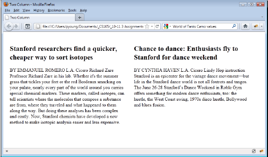
- Save the file as two-column.html.
- Each column should be 400 pixels with 15 pixel margins. Use a font with serifs.
- Actual text should be "borrowed" so you don’t have to type it in. Be sure to cite your source.
- You should utilize headers, images, and other HTML elements
Design Part B: 4 Columns
Reproduce the following four-column webpage (consisting of headlines from the Stanford Report) using CSS float layout:
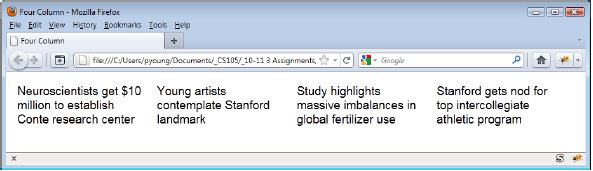
- Save it under the name four-column.html.
- Your webpage does not have to look exactly like the one above, but it should contain four-columns, each column should be 200 pixels wide with 10 pixel margins. Use a font without serifs.
- Actual text should be "borrowed" so you don’t have to type it in. Be sure to cite your source.
- You should utilize headers, images, and other HTML elements
Design Part C: Combined Columnar Design
Use your knowledge from Part A and Part B to create a new file called combined.html.
Here is an idea what your combined webpage might look like:
Here is an idea what your combined webpage might look like:
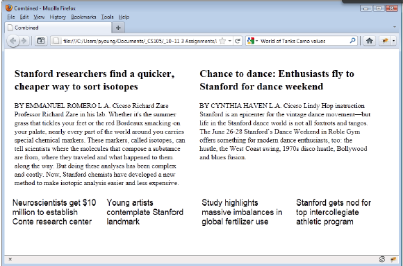
- It is not necessary to do a 2 col / 4 col decide. The intent is that you create a design where you have two sections that have different number of columns
- Actual text should be "borrowed" so you don’t have to type it in. Be sure to cite your source.
- You should utilize headers, images, and other HTML elements
Design Part D: Advanced Layout and Design I
Time to apply what you have learned so far. The goal is to create a page that has a design similar to the following: (Do not waste your time trying to replicate the content. Be original and find your own idea and interests. Perhaps, your favourite band and their upcoming concert dates)
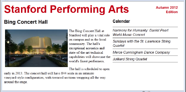
- A masthead across the top with “Title” on the left and “Edition Information” on the right, right-justified with “Edition” below “Spring 2014”
- possible measurements for the title: color #cc0000, 36 point bold, sans-serif
- possible measurements for the Edition information: color # cc0000, 12pt bold - The main article section on the left with the text floating around the image as shown.
- possible measurements for the Sub Heading above the image: 18pt, bold, sans-serif - Calendar section on the right, with events listed below. Note the use of lines between the events plus an additional line between the Calendar heading and the first event and a line below the last event as shown. Use style sheets to create these lines, not the <hr /> tag.
- possible measurements for the “Calendar” title: 14pt, bold, sans-serif
- possible measurements for the Calendar items 12pt, italic, sans-serif - In the above design:
- Article text is default serif font.
- Overall Width 800px
- Article Column Width: 500px
- Calendar Column Width: 300px - If you use the <h1>, <h2>, and <h3> tags to create your headings (which is recommended), you’ll need to override the standard margins otherwise you headings will take up too much space. This is commonly done on professional webpages. In fact, many professionals use a “CSS Reset” with their webpages, which resets all the margin and padding on all HTML elements to 0px.
Design Part D: Advanced Layout and Design 2
Create a page similar to the following “Facebook-like” webpage.
As you can see, the webpage consists of a photo, some information about the person, and a set of status updates. On the right, using form elements, the user is able to enter in new updates, which will be added to the status updates shown in the center. Don't worry. It doesn't have to actually function at this point.
You don’t have to make a page for the dog Molly, you can substitute your own information, but don’t use any time thinking about this, we are only interested in the webpage layout. Also if you enter your own material, make sure it stays at the PG-level or below – any R- or X-rated websites will receive an automatic zero.
Here’s an idea of what the webpage might look like:
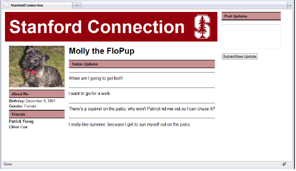
Things to consider when making your design:
- A banner which runs across the top of the left two columns (but not across the “Post Updates” column.
- As seen in the screenshot the banner should have a Logo. Note that the actual “Stanford Connection” is text (not part of a graphic image) and it should remain text.
- A column on the left consisting of a picture, followed by information about the user.
- Two sections below the picture, one for “About Me” and one for “Friends”.
- Titles in the “About Me” section like “Birthday” or "Status" should be bolded, while actual values such as December 8, 2001 are not bolded. Friends’ names are bolded.
- Each of the sections “About Me”, “Friends”, “Status Updates”, and “Post Updates” should have a colored background They should also have a 2-pixel black border on the top and bottom but no border on the sides.
- Status updates should be separated by thin lines as shown.
- The right column should include a “Post Updates” heading, a text area, and a submission button. As we don’t yet know how to execute programs with our webpages, the button “Submit New Update” won’t actually do anything.
- Leave a reasonable amount of space between columns.