Colour Theory
When designing a website, one of the most important factors to consider is the use of colour within the site. Coordinating the colour scheme between layout and graphic elements creates unity or harmony in a design. It has the power to sway the viewer, attract attention, and establish emotional mood or impact. It plays a role in keeping people at your site or turning people away before they even take the time to look at the actual content. The wrong use of colour can result in pages that are ugly and / or challenging to read.
Colours used on a website need to be visually appealing, but also reflect the content or message of the site.
Colours used on a website need to be visually appealing, but also reflect the content or message of the site.
A few classes ago, we watched a slide show: Basic Colour Theory (Slide Show) and played around with some online colour tools. Now it is time to go into a bit more depth and demonstrate your understanding.
Cool Sites to Check Out - Play around with
|
|
|
- http://www.colorhexa.com/
- ColorHexa.com is a free color tool providing information about any color and generating matching color palettes for your designs (such as complementary, analogous, triadic, tetradic or monochromatic colors schemes).
- Just type any color value in the search field and ColorHexa will offer a detailed description and automatically convert it to its equivalent in Hexadecimal, RGB, CMYK, HSL, HSV, CIE-LAB / LUV / LCH, Hunter-Lab, XYZ, xyY and Binary.
Part 1: Basic Understanding: Need to Know
Through research on the Internet, show your understanding of the following: ( Within your definitions, include images that help to clarify your definition) ... Later in this document, you will find some useful resources:
Enrichment / Extensions:
- Using the RYB Color wheel / Subtractive model, show your understanding of the following:
- primary colors
- secondary colors
- tertiary colors
- Basic colour harmonies or schemes
- complementary colours
- analogous colours
- triadic colours
- split complementary colours
- rectangular (Tetradic) colours
- square colours
- warm colours - what are they and what impact do they have
- cool colours - what are they and what impact do they have
- neutral colours
- monochromatic colours / colour scheme
- hue
- saturation
- tints and shades (lightness and value)
- luminance or value
Enrichment / Extensions:
- CMYK Color System used in printing
- Additive Color System (RGB)
- Pantone Colors
Part 2: Colour Psychology and Symbolism
- It is important to understanding that colour has the power to affect us mentally and physically and is perceived differently across many cultures.
- Meanings associated with a colour can vary across cultures:
- In North America, brides wear typically wear white, but in some asian cultures white is associated with death and mourning.
- Even within the same culture, colors can have different (sometimes even opposing) meanings based on context. The bad guy may wear black, but so do judges in the courtroom. Red can be a warning of impending danger, but cards bearing red hearts are exchanged on Valentine's Day.
- Meaning associated with colour are also subjective across individuals and their unique experiences.
- For instance, a person who's grandmother always dressed in yellow could subconsciously associate yellow with happiness because of the many wonderful experiences they had with their grandparents. Alternatively, if their grandmother was cruel and insensitive, a person could subconsciously associate yellow with feelings of loneliness, fear, and isolation.
- For instance, a person who's grandmother always dressed in yellow could subconsciously associate yellow with happiness because of the many wonderful experiences they had with their grandparents. Alternatively, if their grandmother was cruel and insensitive, a person could subconsciously associate yellow with feelings of loneliness, fear, and isolation.
- Meanings associated with a colour can vary across cultures:
- In this assignment, you are to research colour(s) in terms of:
- Your own experiences and preference(s) when it comes to colour - likes, dislikes, etc.
- Literal and symbolic meanings
- Cultural connections
- Variations of a colour(s)
- Use of colour in phrases and songs (Once in a blue moon, Seeing red, Follow the yellow brick road)
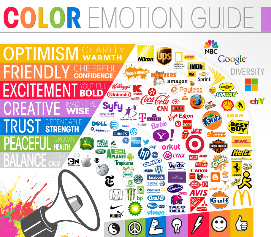
- discussion of how colour is used in marketing and branding
- Within your assignment, be sure to include examples of the colour in use in advertising and web design
Resources:
http://zevendesign.com/color-association/
https://www.colorpsychology.org/
https://colormatters.com/
https://designschool.canva.com/blog/color-meanings-symbolism/
https://www.helpscout.net/blog/psychology-of-color/
https://www.slideshare.net/sunewberry/the-psychology-of-color-16444614
Part 3: Colour Palettes in Action - Designing with Colour
Idea of assignment taken from:
|
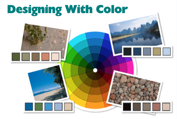
Assignment 1: Colour Scheme from a Photograph
| ||
2 ways to go about creating your palette:
- In a graphic program such as Photoshop, Illustrator, Gimp, InDesign, or Fireworks, use the eye dropper / colour picker tool to select areas of the photo and create a series of swatches that reflect the colours
- Start by creating lots of squares and fill them with a range of colours from the image. You might only extract eight or ten colours, or you might find you need more.The exact number will vary depending on your image. Another suggestion is to sort each colour group by value from dark to light, deleting any colours that are too similar. When you have a good selection from which to choose, play around with the swatches and try different groupings before settling on your final five scheme colours.
- Use a web tool like the adobe colour tool and import your picture. The computer does the work for you.
- In addition to the sites we played with previously in class, try:
Assignment 2: Using Colour Theory to Create a Range of Palettes
- Choose a ‘base’ colour (or you can take this from an image that will feature in your publication), then use colour theory to find colours that harmonize with it.
- Using your base colour and its position on the colour wheel, you can now start to create a range of colour palettes that will work well with your website. There are several approaches you can take, including:
- Is it warm or cool?
- Analogous
- Monochromatic
- Complementary
- Split complementary colours
- Primary, secondary, or tertiary colours
- Triadic colours
- Rectangular (Tetradic) colours
- Square colours
Check these out:
Colour Theory Resources to Check Out:
| color-coordination.pdf |
Example of a colour guide:
Web Design
| hf_-_colour.pdf |