CSS - Backgrounds - An Introduction
CSS has properties that allow you to set a background color, or image(s), or both, on your pages. In fact, you can apply background effects to an entire page or to particular elements of your page such as a specific headline or behind a paragraph. This technique is used to add focus and visual appeal to pages.
Part 1: Background Colors
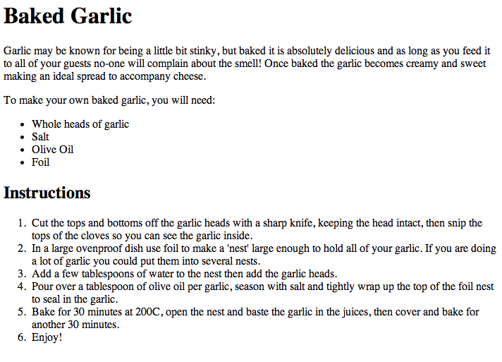
Before we get started, download the following file and open it up in your html editor. It won't look pretty.
|
| ||
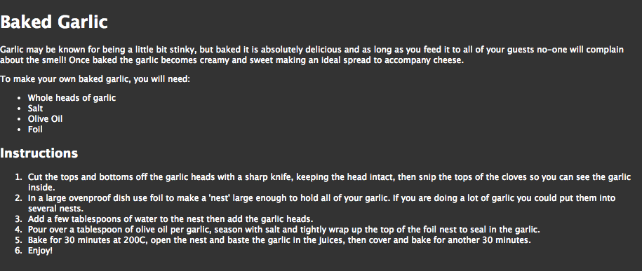
Now let's do a little bit of styling that will effect the contents of the entire page. Specifically to set the background color of a entire page. The background-color property simply adds a color to the page or element to which it’s applied.
In the style section, add the following rule:
body {
background-color: #333333;
color: #ffffff;
margin: 0px;
padding: 0px;
font: 0.75em/1.3 "Lucida Grande", "Lucida Sans Unicode", "Lucida Sans", Verdana, Tahoma, sans-serif;
}
If we examine the above code closely, we will see that it had the following impacts:
|
|
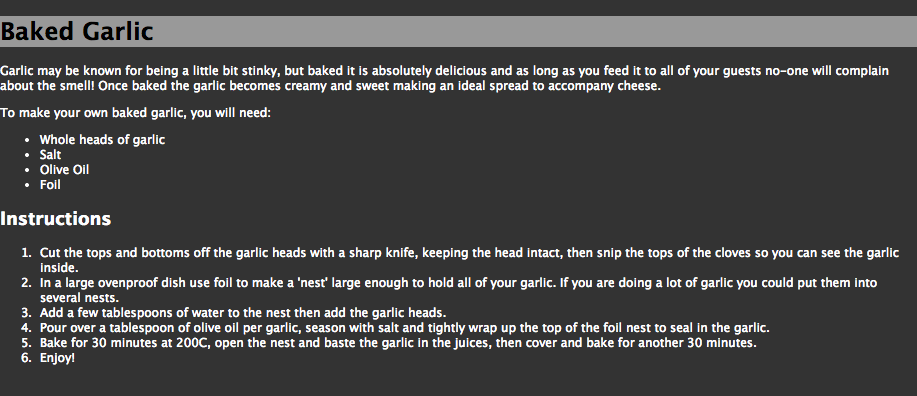
Just like we controlled the background color of the entire page, we could control a specific element. Experiment with the following, being sure to undo your change each time so you can see the full impact of the next experiment.
|
For instance, we could effect the h1 by adding a rule to our style section such as:
h1{ background-color: #999999; color: #000000; } |
|
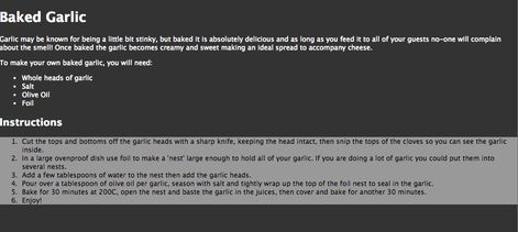
For instance, we could effect the instructions by adding a rule to our style section such as:
ol{ background-color: #999999; color: #000000; } |
|
Although neither of these may be attractive or the look you are going for, it is important that you understand that background-color can be applied to specific elements or to an entire page.
Before we get going, get rid of the <h3> and / or the <ol> rules so that we are back to the solid background applied to the entire page.
Before we get going, get rid of the <h3> and / or the <ol> rules so that we are back to the solid background applied to the entire page.
Part 2: Simple Background Images
Applying a background image is really simple. The background-image property allows you to specify an image to be loaded and displayed as a background image. In this case, we wantto add it as a background image for the whole page so we add it to the rule that we created to control the body of the page. You can use background images on most elements, which we will see later..
body {
background-color: #333333;
background-image: url(images/brushed_dark.png);
color: #ffffff;
margin: 0px;
padding: 0px;
font: 0.75em/1.3 "Lucida Grande", "Lucida Sans Unicode", "Lucida Sans", Verdana, Tahoma, sans-serif;
}
background-color: #333333;
background-image: url(images/brushed_dark.png);
color: #ffffff;
margin: 0px;
padding: 0px;
font: 0.75em/1.3 "Lucida Grande", "Lucida Sans Unicode", "Lucida Sans", Verdana, Tahoma, sans-serif;
}
|
By default the background will tile. In this example, "brushed_dark.png, is actually a smaller tile. The browser simply repeats the tile to fill the available space in the element, in this case the entire page.
|

|
Don't believe me... then let's try this. Modify the rule so that the background image is now "stripe.png"
body {
background-color: #333333;
background-image: url(images/stripe.png);
color: #ffffff;
margin: 0px;
padding: 0px;
font: 0.75em/1.3 "Lucida Grande", "Lucida Sans Unicode", "Lucida Sans", Verdana, Tahoma, sans-serif;
}
body {
background-color: #333333;
background-image: url(images/stripe.png);
color: #ffffff;
margin: 0px;
padding: 0px;
font: 0.75em/1.3 "Lucida Grande", "Lucida Sans Unicode", "Lucida Sans", Verdana, Tahoma, sans-serif;
}
While it creates a totally different effect, it still doesn't prove my point. As we already know, the smaller image is tiled repeatedly across the entire page. Don't believe me... resize the window and watch what happens.
|
This is the actual image:

|
To see it in action, modify your body rule to include a background-repeat that prevents the background from repeating at all.
body { background-color: #333333; background-image: url(images/stripe.png); background-repeat: no-repeat; color: #ffffff; margin: 0px; padding: 0px; font: 0.75em/1.3 "Lucida Grande", "Lucida Sans Unicode", "Lucida Sans", Verdana, Tahoma, sans-serif; } |
The only background image we’d see would be a single square of the tile in the top-left corner.
If we wanted to only tile along the x axis, we could use the following instead:
background-repeat: repeat-x;
If we wanted to only tile along the x axis, we could use the following instead:
background-repeat: repeat-x;
This effect is great way to apply a background design behind a title or heading.
Similarly, if we wanted to only tile along the y axis, we could use the following instead:
background-repeat: repeat-y;
Similarly, if we wanted to only tile along the y axis, we could use the following instead:
background-repeat: repeat-y;
You might ask why would we do this, but this is a fabulous way to make a page look more professional. For instance, if we were to add a margin-left property to our body, we create a way different looking page.
body {
background-color: #333333;
background-image: url(images/stripe.png);
background-repeat: repeat-y;
color: #ffffff;
margin: 0px;
margin-left: 100px;
padding: 0px;
font: 0.75em/1.3 "Lucida Grande", "Lucida Sans Unicode", "Lucida Sans", Verdana, Tahoma, sans-serif;
}
body {
background-color: #333333;
background-image: url(images/stripe.png);
background-repeat: repeat-y;
color: #ffffff;
margin: 0px;
margin-left: 100px;
padding: 0px;
font: 0.75em/1.3 "Lucida Grande", "Lucida Sans Unicode", "Lucida Sans", Verdana, Tahoma, sans-serif;
}
Now the background tile seems like it is part of the design of the page and it does not distract from the text. In fact, if anything, the text is easier to read because it doesn't blend in with the background tile.
Part 3: How to position a background image precisely:
|
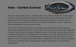
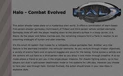
Download the following file and open it up in your html editor.
|
| ||
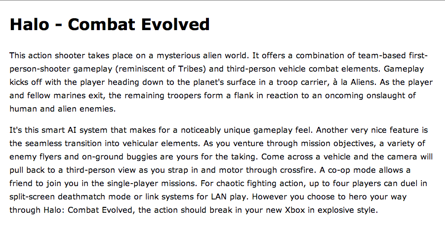
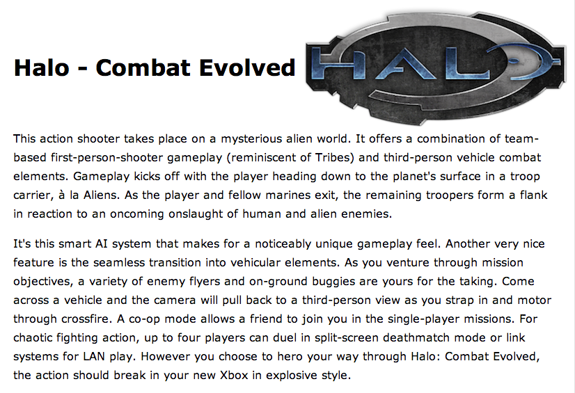
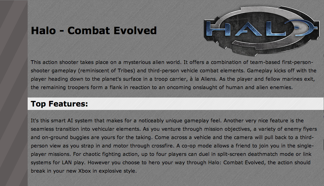
Nothing to great. First step, lets add a background image by modifying our <body> rule:
body {
color: #000000;
background-image: url(images/halo.png);
margin: 20px;
padding: 0px;
font: 1em/1.7 Verdana, Tahoma, sans-serif;
}
body {
color: #000000;
background-image: url(images/halo.png);
margin: 20px;
padding: 0px;
font: 1em/1.7 Verdana, Tahoma, sans-serif;
}
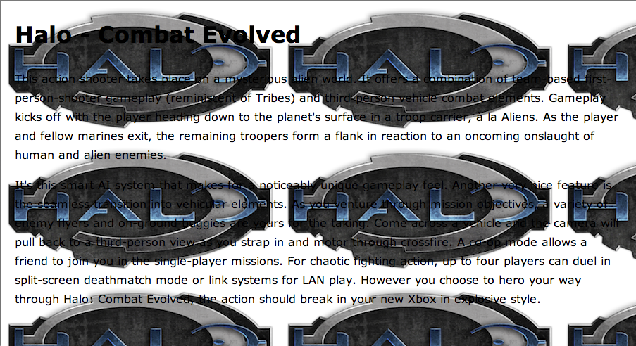
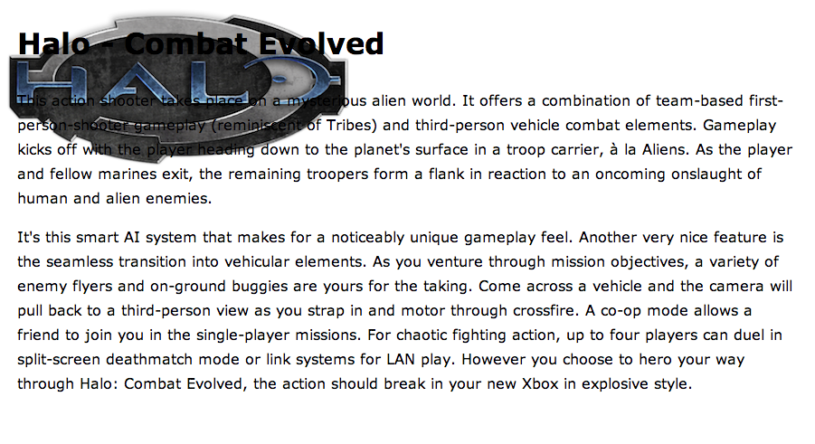
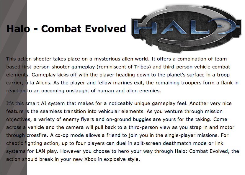
Wow! Looks like the background image (halo logo) threw up on the page. Not only did it tile over the entire page, you can't read the text over the logo. So how do we go about fixing this mess?
First, we start by making sure the image does not tile (remember that background-repeat property)
body {
color: #000000;
background-image: url(images/halo.png);
background-repeat: no-repeat;
margin: 20px;
padding: 0px;
font: 1em/1.7 Verdana, Tahoma, sans-serif;
}
First, we start by making sure the image does not tile (remember that background-repeat property)
body {
color: #000000;
background-image: url(images/halo.png);
background-repeat: no-repeat;
margin: 20px;
padding: 0px;
font: 1em/1.7 Verdana, Tahoma, sans-serif;
}
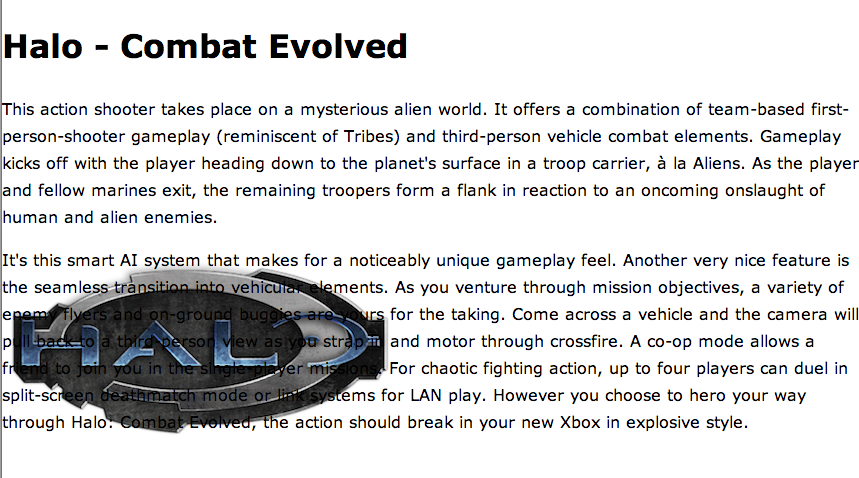
As we can see, by default, if you add a single, non-repeating background image to the page, it will appear in the top-left corner of the viewport.
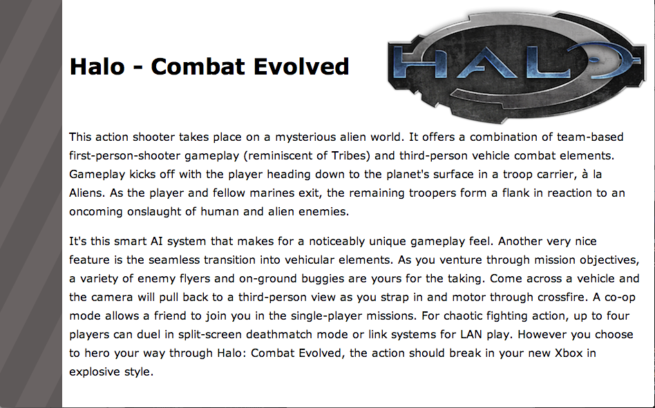
However, it’s possible to display the image at other locations on the page.
body {
color: #000000;
background-image: url(images/halo.png);
background-repeat: no-repeat;
background-position: top right;
margin: 20px;
padding: 0px;
font: 1em/1.7 Verdana, Tahoma, sans-serif;
}
However, it’s possible to display the image at other locations on the page.
body {
color: #000000;
background-image: url(images/halo.png);
background-repeat: no-repeat;
background-position: top right;
margin: 20px;
padding: 0px;
font: 1em/1.7 Verdana, Tahoma, sans-serif;
}

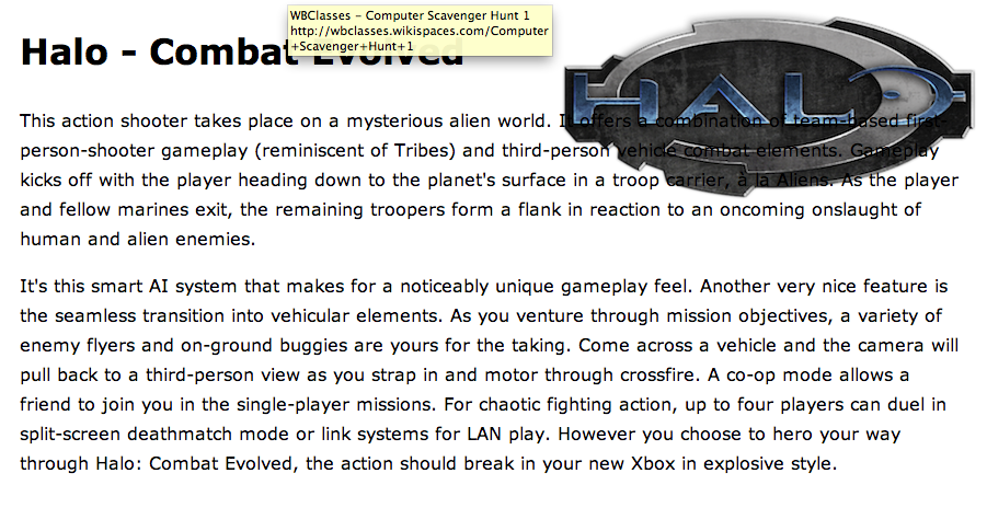
As we can see, this repositioned the halo logo to the top right corner of the page.
The background-position property can take as its value keywords, percentage values, or values in units, such as pixels.
As you read through the following, don't be afraid to experiment with the values so you can truly gain a sense of what each does to the placement of the image on the page.
The background-position property can take as its value keywords, percentage values, or values in units, such as pixels.
As you read through the following, don't be afraid to experiment with the values so you can truly gain a sense of what each does to the placement of the image on the page.
|
Keywords:
In this example, we used keywords to specify that the background image should be displayed at the top right of the page: You can use any of these keyword combinations:
Be careful, if you only specify one of the values, the other will default to center Ex. top = top center right = center right |

|
Percentage Values:
To achieve a more accurate image placement, you can specify the values as percentages. (This approach is particularly useful in a layout where other page elements are specified in percentages, so that they resize in accordance with the user’s screen resolution and dimensions. This becomes particularly important when creating responsive designs)
background-position: 30% 80%;
The first of the percentages refers to the background’s horizontal position; the second dictates its vertical position.
Percentages are taken from the top-left corner of the display, with 0% 0% placing the top-left corner of the image against the top-left corner of the browser window, and 100% 100% placing the bottom-right corner of the image against the bottom-right corner of the window.
As with keywords, a default percentage value comes into play if you only specify one value. That default is 50%. Take a look at the following declaration:
background-position: 30%;
creates the same effect as:
background-position: 30% 50%;
Unit Values:
ou can set positioning values using any CSS unit, such as pixels or ems:
background-position: 20px 20px;
As with percentages, the first of the specified values dictates the horizontal position, while the second dictates the vertical. But unlike percentages, the measurements directly control the position of the top-left corner of the background image.
You can mix units with percentages and, if you only specify one value, the second will default to 50%.
Let's get moving again
|
Before we continue, we better reset the background position:
background-position: top right; |
|
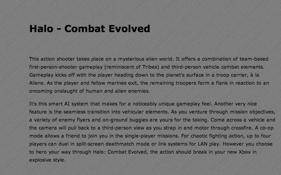
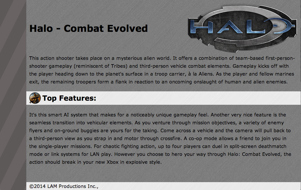
Be honest, things look a little off. It is really awkward that the text goes over the logo. There are lots of ways to fix this, but because I want the "Combat" title to stay to the left of the logo and aligned vertically with the writing on the logo, the best solution is to control the <h1> by creating a rule in our style section.
h1{
margin-top: 70px;
}
h1{
margin-top: 70px;
}
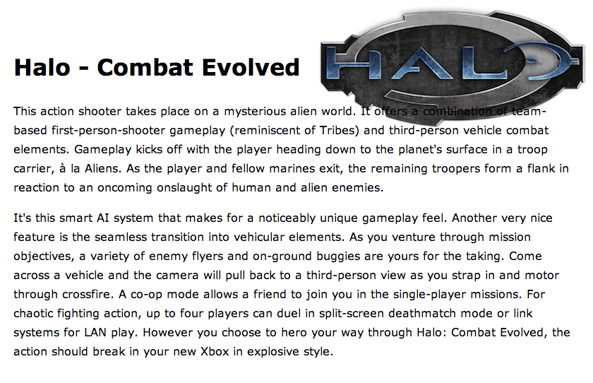
Looking better, but let's use a similar technique to control the first paragraph. This time though, let's practice using an inline style that effects only a specific tag.
<p style="padding-top: 40px;">
This action shooter
<p style="padding-top: 40px;">
This action shooter
Before we move on, who doesn't like a shortcut. These two mean the exact same thing:
|
background-image: url(images/halo.png);
background-repeat: no-repeat; background-position: top right; |
background: url(images/halo.png) top right no-repeat;
|
What about if we want to add more than one background image to an element?
CSS2 only allowed for one background image to be applied to an element. In CSS3, however, you can add multiple background images. (This is where shortcuts become important)
Using the shorthand background property that we discussed earlier, we can simply add a list of background images and positioning information for the background property (each image is separated by a comma):
Using the shorthand background property that we discussed earlier, we can simply add a list of background images and positioning information for the background property (each image is separated by a comma):
background: url(images/halo.png) top right no-repeat, url(images/stripe.png) top left repeat-y;
|
|
You guessed it... you probably needed to fix that pesky left margin issue like we did earlier.
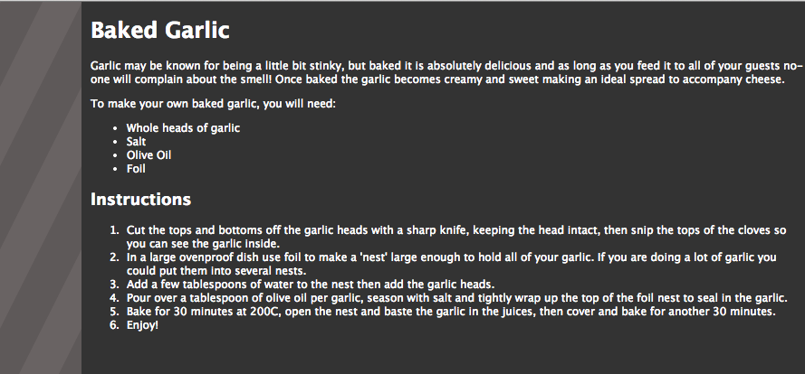
It’s worth noting that the order of the images is important. The first image you declare will display on top of the stack, with the last being at the bottom. We can see how this works by adding a background texture to our page.
It’s worth noting that the order of the images is important. The first image you declare will display on top of the stack, with the last being at the bottom. We can see how this works by adding a background texture to our page.
|
If I add the background tile as the first image, it displays tiled on top of everything else:
background: url(images/brushed_dark.png), url(images/halo.png) top right no-repeat, url(images/stripe.png) top left repeat-y; |
|
|
But if I switch the order so the background tile is second in the list, I am only hiding the side stripe.
background: url(images/halo.png) top right no-repeat, url(images/brushed_dark.png), url(images/stripe.png) top left repeat-y; |
|
|
Finally, if we were to make it the last image in our list, it would display underneath the rest of the page content and background images.
background: url(images/halo.png) top right no-repeat, url(images/stripe.png) top left repeat-y, url(images/brushed_dark.png); |
|
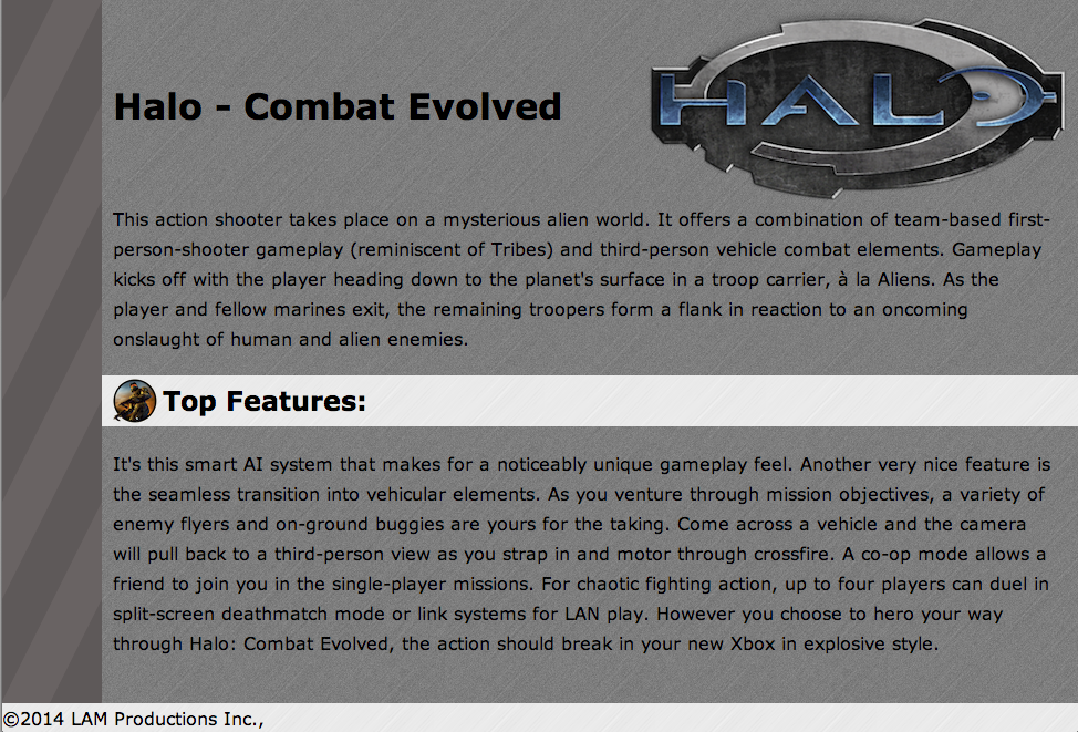
Before we leave this example, don't forget that I said you could apply background images to almost any element. For instance, here would be a simple <h2> element that has been stylized:
|
First, in the body section, I created an <h2> for the "Top Features" header
<h2>Top Features: </h2> Second, I created a rule for the <h2> in the style section of my page. h2 { background-image: url(images/brushed_light.png); margin-left: -10px; margin-right: -20px; padding-right: 10px; } |
Notice that I had to play with the margins and the padding to get just the right look.
|
Below is a more complex example, where I not only created an <h2> for the "Top Features" header, but I also styled it using a lot of the more advanced concepts covered in this lesson.
h2
{
background: url(images/haloicon.png) 10px center no-repeat, url(images/brushed_light.png);
margin-left: -10px;
margin-right: -20px;
padding: 3px;
padding-left: 55px;
}
h2
{
background: url(images/haloicon.png) 10px center no-repeat, url(images/brushed_light.png);
margin-left: -10px;
margin-right: -20px;
padding: 3px;
padding-left: 55px;
}
We could even create a footer section with a background image applied.
In the body section of your code (just before the </body>) create your footer text
<footer> ©2014 LAM Productions Inc.,</footer>
In your style section, you would create a rule to style the footer accordingly: You will likely need to play around to get the effect you are aiming for.
footer
{
background-image: url(images/brushed_light.png);
margin-left: -10px;
margin-right: -20px;
padding-left: 10px;
position:fixed;bottom:0;
width: 100%;
}
* Note, this could also have been done with paragraphs and classes
Doesn't seem like much. But if we compare it to what we started with, hopefully you gain appreciation for the power of backgrounds when applied creatively to a page or to other elements. (oh yeah... can you spot one more difference from the example above... look at the footer) ... Incredible given we didn't use a single image tag.

The use of background images is a core part of designing for the Web, but how do you know whether an image should be a background image, or if it should be part of the page as a regular image in HTML?
A good rule to follow: if it is crucial to the content of the page in terms of meaning and understanding, then insert it as an image with alternate text. Save background images for purely aesthetic design elements that would be of no interest to a user just reading the text of a page. They are there for design purpose only, not necessary to add meaning to the textual content of a page.
A good rule to follow: if it is crucial to the content of the page in terms of meaning and understanding, then insert it as an image with alternate text. Save background images for purely aesthetic design elements that would be of no interest to a user just reading the text of a page. They are there for design purpose only, not necessary to add meaning to the textual content of a page.
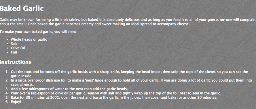
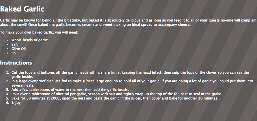
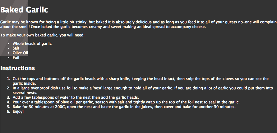
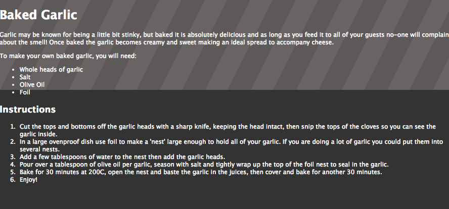
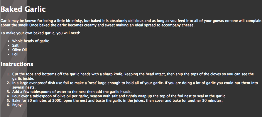
Before we get more into the backgrounds, I want to talk a little bit about dividing our page into sections so that we can control the background effects on different parts of our page.
In this case, we will be dividing our page to create the illusion of a recipe card on a larger page. In otherwords, there will be a very obvious recipe portion surrounded by an outer "wrapper" portion. This is a very common way to ensure that the main content area is centered on a page or that the surrounding margins remain consistent.
background: url(images/brushed_dark.png), url(images/halo.png) top right no-repeat, url(images/stripe.png) top left repeat-y;
Background sites
http://www.w3schools.com/css/tryit.asp?filename=trycss_clip